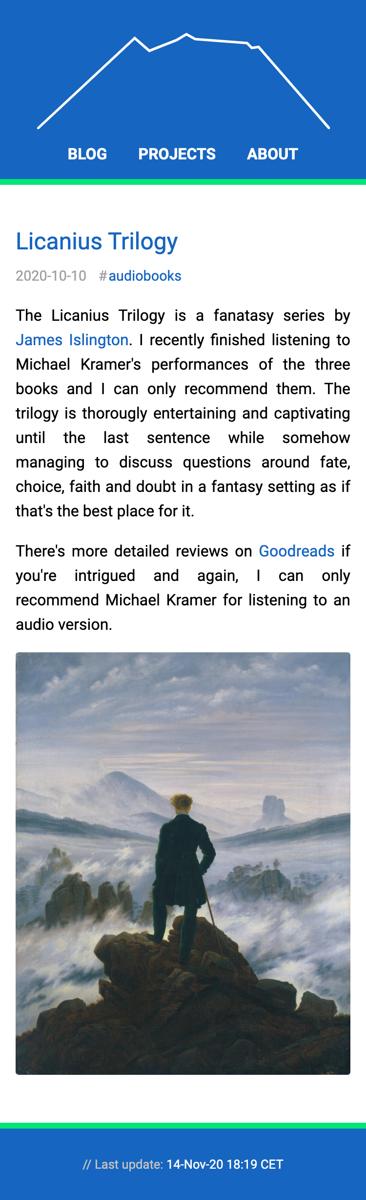
Notes from setting up a responsive layout
This blog is mostly my personal notebook on lessons and other things that I come to appreciate that might also be of interest to others. The other purpose is to act as a playground for exploring CSS, HTML or Javascript bits. I refreshed the layout earlier this year, trying to learn more about responsive layouts and collected some notes, mostly about CSS:
-
For a responsive layout, add a
metatag to reset the viewport width and make sure that pixels are what you expect them to be:<meta name="viewport" content="width=device-width, initial-scale=1"> -
Responsive layout does not necessarily start with media queries, or require them at all. I started out with a layout that worked for my MBP's screen, and then added in media queries, which felt cumbersome and brittle. Consider a simple nav bar, that you style as a row for wide screens but for smaller resolutions you want to turn it into a column instead. My first approach was to start like this:
 <style type="text/css">
 nav {
   display: flex;
   flex-direction: row;
 }
 @media (max-width: 320px) {
      nav { flex-direction: column; }
 }
 @media (max-width: 375px) {
      nav { flex-direction: column; }
 }
 /* ... and so on */
 </style>
 <nav>
   <div>A</div>
   <div>B</div>
   <div>C</div>
 </nav>
The repetition and magic numbers that don't correspond to your layout are what seems cumbersome and brittle to me. I was introducing a dependency that is uncalled for. So my first lesson was to not be guided by the device sizes, but instead follow the layout. In the above example that meant to check what the minimal width was that the nav bar required, and then tie my layout to that number rather than some device screen sizes:
 <style type="text/css">
 nav {
   display: flex;
   flex-direction: column;
 }
 @media (min-width: 500px) {
      nav { flex-direction: row; }
 }
 </style>
 <nav>
   <div>A</div>
   <div>B</div>
   <div>C</div>
 </nav>
In more general terms: Make the mobile view the default and then use
min-widthto identify stops where you can relax the layout to adjust to larger screens. -
As always, it is worth reading the manual 😅. While usage of the CSS selectors seems mostly intuitive, I should have read up on the details. For example, I often used the space or descendant combinator
a band learned that I really mean the child combinatora > b, for immediate children only. -
The selector list combinator has lower precedence than other combinators. More specifically the part that tricked me:
p a, bis grouped as(p a), brather thanp (a, b). -
The order of declaring CSS rules matters if they share specificity. Also, media queries add no specificity.
-
A more general lesson that I'm still trying to learn is when to add classes to elements, or what rules of thumb a more seasoned CSS dev would use when setting up elements and classes for them.
A few weeks ago I came across Josh's article on Full-Bleed Layout Using CSS Grid that triggered me to try again and explore CSS Grid a bit. I ended up using a combination between flexbox and grid, and collected some more notes:
-
Enforcing a lesson from earlier this year, this time I started out with a layout that worked for mobile first and later tweaked it for larger resolutions. For the simple layout of this site it was much easier to start mobile first. And as a bonus, no media queries needed so far.
-
Scaling SVGs is a bit more tricky than I expected. For some iteration of the layout I wanted the logo to scale according to the available space. I wanted to maintain the aspect ratio for the dimensions of the SVG, but the stroke size should be constant:
vector-effect: non-scaling-stroketo the rescue. There's more details if you're curious, and they are explained much better than I could on CSS-Tricks. -
I really enjoy the use of more descriptive tags like
header,nav, etc. rather than spammingdivelements everywhere. Easier to convey the structure without having to interpret CSS classes or other attributes. -
While I developed the layout changes using DevTools' device mode, I ran into issues when looking at the changes on my phone. To create a sticky footer, I used a setup similar to this:
<style type="text/css">
body {
  display: flex;
  flex-direction: column;
  min-height: 100vh;
  margin: 0;
}
main { flex-grow: 1; }
</style>
<body>
  <header>header</header>
  <main>main</main>
  <footer>footer</footer>
</body>
This worked on desktop and with DevTools, but caused a partially hidden footer on mobile browers. The issue is that
100vhsometimes includes the browser's nav bar and sometimes doesn't. First I tried to solve it using intrinsic values, i.e.-webkit-fill-availableand friends following this entry, but found no decent combination that worked for me reliably across mobile and deskotp. I found a simpler solution without vendor specific extensions on the excellent MDN:<style type="text/css"> html { height: 100%; } body { display: flex; flex-direction: column; min-height: 100%; margin: 0; } main { flex-grow: 1; } </style> <body> <header>header</header> <main>main</main> <footer>footer</footer> </body>
To me, correctly styling elements used to feel like poking a big stick at a big Jenga tower (that's years ago to be honest 😅), but using flexbox and the grid feels like having more fine-grained control, maybe more like having a chopstick?
Have fun wielding that chopstick 🥢 😜!
To document some progress, some before after pics:
| Before | After |
|---|---|
 |
 |
 |
|